 |
The hand lettered title for the 1954 film “Power of the Press” was done in a condensed sans serif type style that is now available digitally in both regular and oblique versions as Local News JNL.
 |
The hand lettered title for the 1954 film “Power of the Press” was done in a condensed sans serif type style that is now available digitally in both regular and oblique versions as Local News JNL.
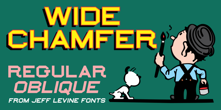 |
Inside the pages of an untitled sign painting textbook (circa 1902) was an example of the classic chamfered sans serif alphabets used by tradesmen of the time.
This version was wider than most, and perfect for a digital version called Wide Chamfer JNL, which is available in both regular and oblique versions.
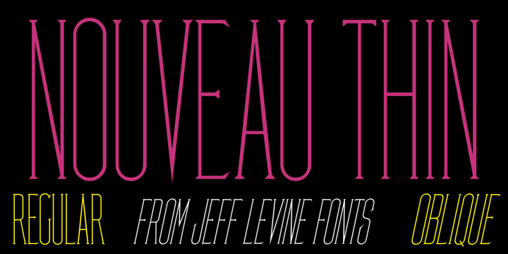 |
A condensed, light face spurred serif alphabet was shown on an antique catalog page from Spon & Chamberlain Publishers as “French”. The catalog likely sold tools and dies to stonecutters for making inscriptions in marble, granite and so forth.
This elegant design is available digitally as Nouveau Thin JNL in both regular and oblique versions.
 |
A vintage brass stencil for an individual or company named ‘Rodrigues’ was spotted in an online auction.
The hand punched, condensed Roman lettering inspired the digital typeface Nameplate Stencil JNL, which is available in both regular and oblique versions.
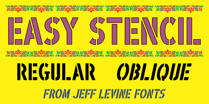 |
Easy Stencil JNL is a simple sans serif stencil design [based on a hand lettered example] from the 1922 publication “Modern Show Card Writing” and is available in both regular and oblique versions.
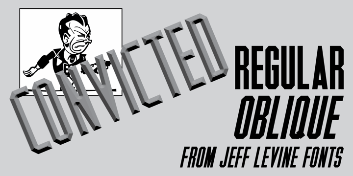 |
Convicted JNL is a condensed, chamfered sans serif type design inspired by opening credits from the 1940 film of the same name – available in both regular and oblique versions.
 |
In the 1920 edition of “How to Paint Signs and Sho’ Cards” by E. C. Matthews is an example of what is termed “poster lettering” that is so free form and unusual it borders on the eccentric.
Resembling lettering more commonly found in 1960s “underground comics” of the Hippie generation rather than of the Art Nouveau period, it oddly enough works well in both styles.
This novelty typeface is now available as Hippie Comics JNL in both regular and oblique versions.
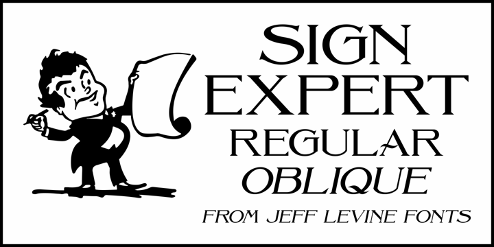 |
An elegant, yet informal Roman alphabet with Art Nouveau influences was found amidst the pages of the 1922 edition of “The Expert Sign Painter”.
It is now available digitally as Sign Expert JNL in both regular and oblique versions.
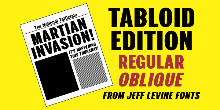 |
The headline across the October 7, 1918 edition of the UK’s Daily Mail stated: "Germany Asks the Allies for Peace".
Set in extrabold sans serif lettering, it’s now available digitally as Tabloid Edition JNL in both regular and oblique versions.
This is another “redrawn from the headlines” typeface from Jeff Levine Fonts.
 |
Firmin Didot is credited with establishing the Modern genre of serif typefaces, of which Beaux Arts Didots stands as an exemplary model. Like the French neoclassical architecture of its namesake, Beaux Arts has all the hallmarks of the early nineteenth-century style: a clear and confident construction consisting of simple yet strong lines. Use it for elegant and formal settings, or when a direct typographic tone is desired. Mix it with styles of similar sensibilities such as Plinc Hanover and Davison Spencerian. Digitized from the original Photo-Lettering film matrix in 2014 by Jean-Baptiste Levée.
BEAUX ARTS DIDOT CREDITS:
Like all good subversives, House Industries hides in plain sight while amplifying the look, feel and style of the world’s most interesting brands, products and people. Based in Delaware, visually influencing the world.
©
Valeriya Ozerova
2014 . Powered by
Blogger
Blogger Templates
.
.